Introduction
If You’re Wondering what a website teardown is, it’s where I look at apartment websites and point out the things I think work well, things I think don’t work, and opportunities for improvement. So Today, I’ll be taking a look at Atlas Oakland.
Before reading on, I’d recommend checking out www.atlasoakland.com
During this Apartment Website Teardown, I’ll be touching on a few points in design, branding, and online marketing – which of these they are doing well and which parts could be improved.
Arriving on the Atlas Oakland Website
So the first thing I’m hit with when entering the Atlas Oakland site is a popup with an offer. It states the special offer and creates urgency. However, there is no clear next step here.

Ideally, this would have an enter details or lead to a form because if the user doesn’t decide to get in touch, it’s essentially a lost lead. With popups like these, you always have to guide the user to a next step.
A First Look at How Atlas Oakland Sell Lifestyle & Experience
After closing the popup, it’s clear that Atlas Oakland is selling a lifestyle, not a rental. This is good because most apartments focus on features but what stands out to prospects is a lifestyle.
Their media is focused on a couple of things and presented in a luxurious way, almost dreamy. The first is lifestyle or experience, and the second is the building itself. Instead of showcasing solely amenities, they went a different direction, allowing the user to imagine themselves living in the building, creating a sense of exclusivity.
This is a strategy similar to what you see in luxury hotels like Four Seasons.
You also see this in the consumer goods industries. For example, Apple. Apple sells exclusivity and simplicity, not technology.
Or Mercedes, who sell status, not cars.
They sell feelings
Website Style
The use of black, golden brown, and white mixes well to portray the desired luxury feel. The typography also reflects this feeling of luxury, using a classic look Serif (like Rolex, Prada, BOSS) for heading text and mixed with a modern, clear body Sans Serif. The photography and videography maintain the color schemes and reinforce the emphasis on luxury living.

CTA’s & Menus
The CTA’s and menu take 2nd place here, but are always present, this helps guide people through the story and content. The subtle top right menu (hamburger style), Live chat on the bottom left, and schedule a tour on the bottom right create a reminder that if you can’t find what you’re looking for, help is close but without being intrusive or interfering.
As we scroll down there are some key points covered:
- First section – Virtual Tour
- Second Section – View Residences
- Third Section – Amenities
- Fourth Section – Availability
- Fifth Section – Map
- Sixth Section – Surroundings & Neighborhood – should have been further up
- Seventh Section – Green Living Guide – a lot of other things I would have included
Points of Opportunity
Throughout the page, the emphasis is maintained heavily on lifestyle which is a great way to build a brand. The colors, image style, content & messaging are all on point, however there are a few major things that are missing for me here:
Social proof (reviews)
This would be an essential factor for me as a prospect looking to rent an apartment. If I owned a property with 178 Google reviews and top 3 Ora Elite Status like Atlas is, I’d certainly want to boast that and use it as a selling factor for potential clients. Social proof is a key part of any website as it immediately provides credibility.
Community
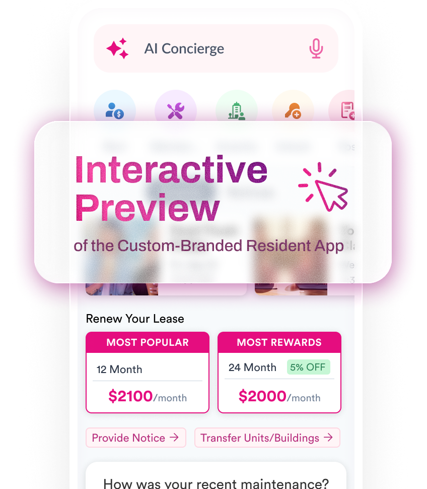
Another point which hasn’t been portrayed. Atlas has an app for residents which encourages community building and they also host regular resident events, which again, is not presented on their website. This for me would be another swaying factor as a potential resident.
Technology
Atlas uses technology to facilitate everything from move-in, on-site services, rent payment, door access etc. to make life much easier for Atlas residents. Given how much technology permeates our every day life but is missing in many apartments, means that this technology-focus is a major competitive advantage for Atlas and a lifestyle selling point.
Pricing
Linked from the home page section and menu you’ll find ‘Availability’, this is where pricing is also found. My concern here is that from the home page, it’s not clear to the prospect how to quickly find if it’s within budget, which could cause frustration and lead to a lost opportunity.
Blog
Although Atlas has a blog with great information for potential residents, they chose not to include this on their menu or home page of the website – only on the footer. My recommendation here would be to add the articles to a carousel somewhere on the homepage content. This is for a few reasons, the first being if I was investing the time to generate useful content that’s intended for prospects, I’d want to showcase that and encourage engagement on the site. The second reason is if you are posting regularly, it shows you are an active company to both the prospect and for SEO purposes.
Exit Popup
With the right timing and message, exit intent popups are a great lead generation tool. I’d recommend implementing a popup when the user attempts to leave the site to assist in a couple of things, one to help them find the information they were looking for and two, to get their contact details. It also helps keep them on your site longer which in turn, lowers bounce rate and helps rankings.
Online Performance
Brand Focused Positioning
First impressions are good, they dominate the first page of Google for their brand keyword ‘Atlas Oakland’ using various methods. The first being Google Ads (shown on the listing), then at the top of the organic search you’ll see their listing, along with various site-links underneath which allows for easier navigation.
You’ll notice that the right side of the screen is dominated by their Google MyBusiness profile, which is an essential part of this type of business and a great source of information for potential renters. They have done well by fully utilizing the profile tools to really showcase their business and dominate this right hand panel. However, the lifestyle or experience messaging has been missed and ideally should match the messaging conveyed throughout their website
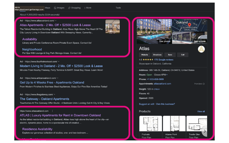
So between the 3 methods – Paid (PPC), Organic and Google MyBusiness they have effectively covered the top 1/3rd of the page page on search for their brand keywords.
Brand Keywords – ‘Atlas Oakland’
If you look at the total brand associated keywords you’ll get an idea of how well they are doing in branding, with over 4000 users searching specifically for their brand per month, and they hold 1st position on Google for almost all their brand keywords.

Generic Keywords
If we take a look at some of the more generic keywords (Not including Atlas), you’ll see there is room for improvement, there are numerous keyword variation examples with high volume, which Atlas Oakland isn’t performing for, so although their brand keywords are strong, there is great opportunity being missed here with relatively low competition.

Reviews
This is the final topic I’ll cover today and one that’s pretty exemplary! Atlas Oakland boasts 178 reviews on Google MyBusiness with an average rating of 4.6 stars, compared to the national average of 3.8 stars. Across all review websites, they have a whopping 328 reviews with 84.76% of those being 5 stars! This is definitely something that I’d consider including!

To Wrap It Up
In general, the branding and messaging are on point, with some key opportunities to improve user experience or journey as well as some traffic opportunities that could generate traffic, turning into new leads.
Don’t forget to follow-me on LinkedIn and subscribe to Flamingo’s LinkedIn and YouTube for more website teardowns. And comment if you want your website to be the next featured website.

