
I’d like to welcome you to my Apartment Website Teardown Show. If you’re wondering what a website teardown is, it’s where I look at apartment websites and point out the things I think work well, things I think don’t work and opportunities for improvement. So Today I’ll be taking a look at Bells Bluff by Elmington.
If you aren’t familiar with their website, I encourage you to check it out here: https://www.bellsbluff.com/
During this I’ll be touching on a few points in design, branding and online marketing – which of these they are doing well and which parts which could be improved.
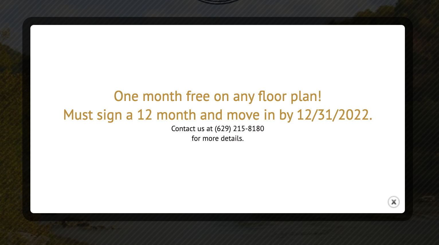
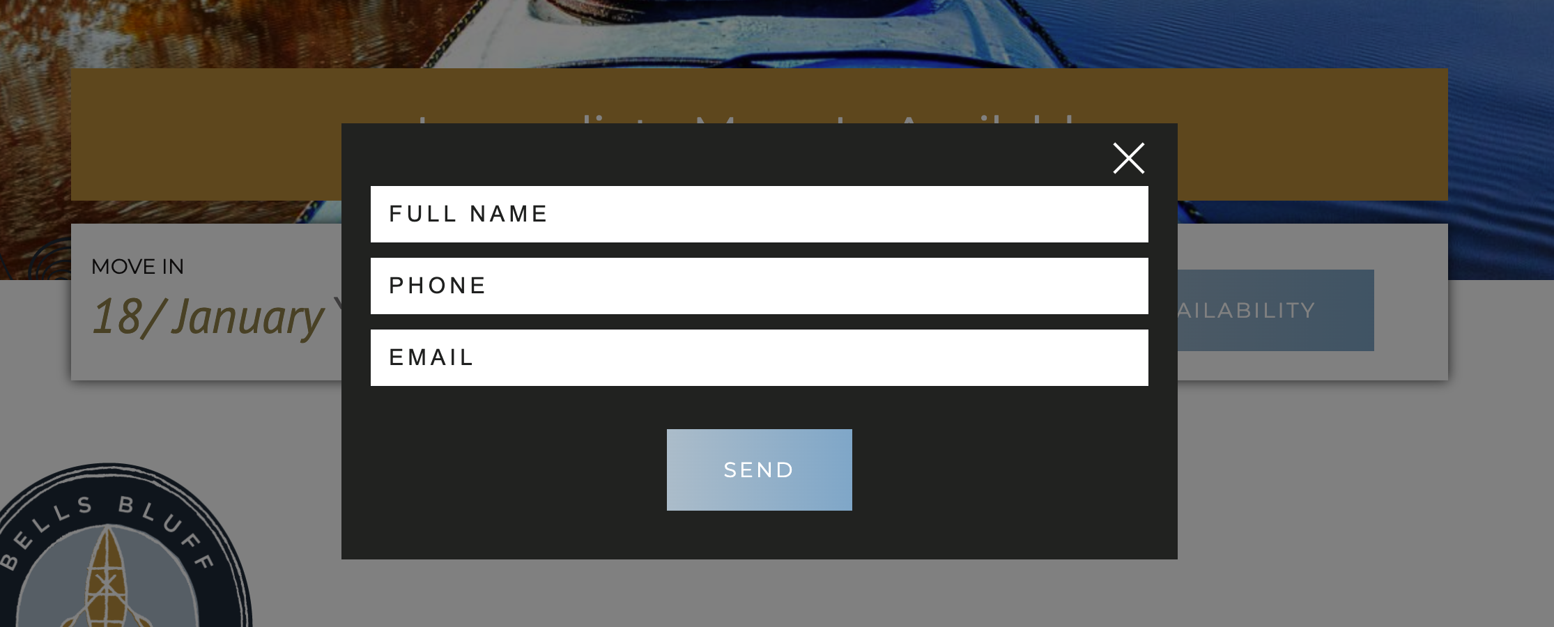
Intro Popup
When I enter the Bells Bluff Website I’m hit with a pop-up with an offer and urgency, but no clear next step. They added the contact information right under the title text which doesn’t really stand out or have any impact. I would recommend guiding the user with something like ‘Schedule a Tour Now’. A button could also work in this situation, guiding the prospect to either a contact form, or to view the floorplans.
First Impression
After closing the popup, I get the immediate sense of nature, adventure, peace, harmony and country living, fresh air. They achieved this by not just showing the apartments, but instead showing the lifestyle and what the surroundings have to offer. They have a clear target demographic – nature lovers.
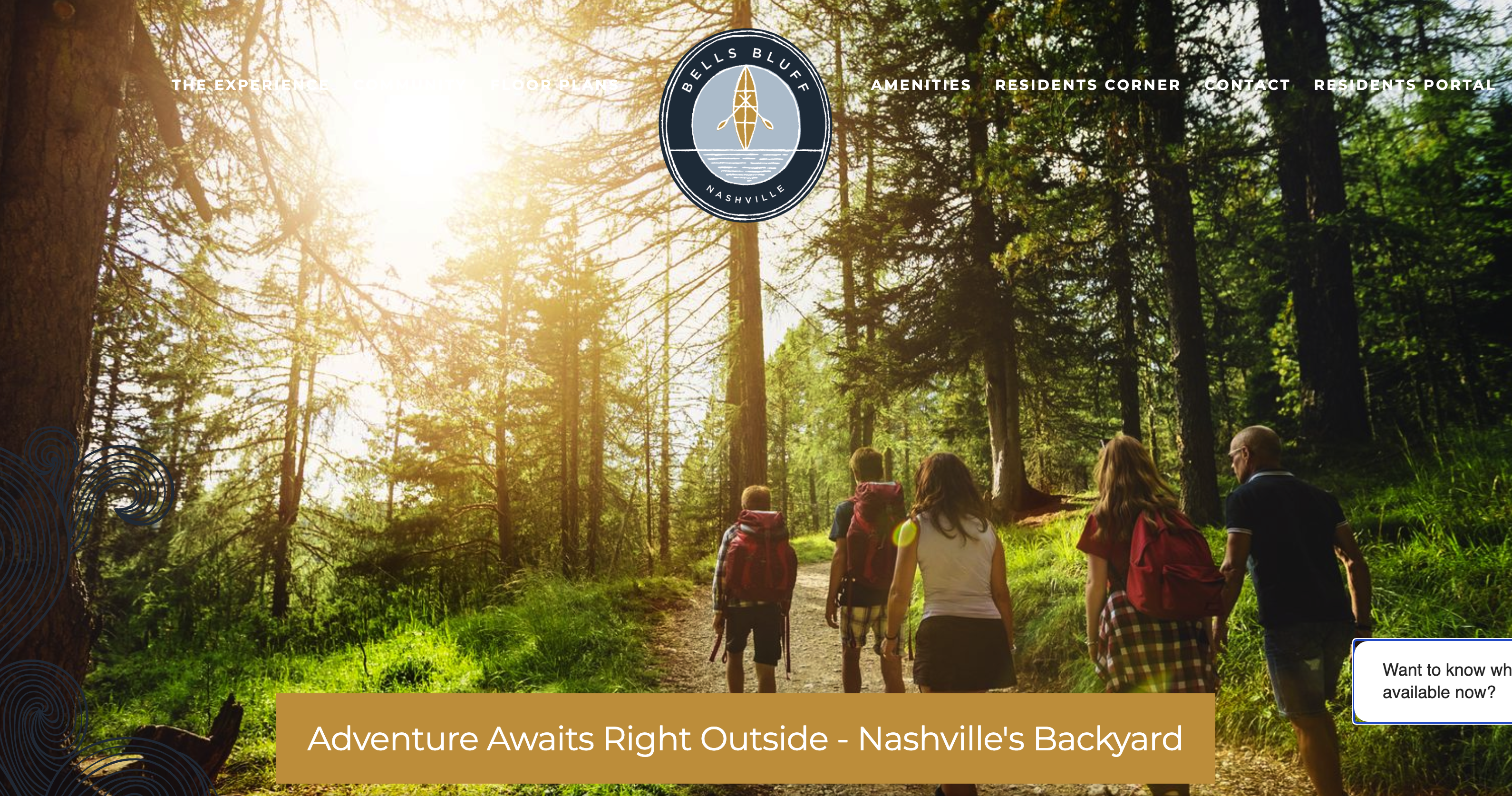
This is reflected on all the elements from the logo, imagery, earthy color palette, and even messaging. The logo fits well with the brand goal, with pastel tones of light blue, dark blue and golden brown, with the soft brush outline stroke helping to maintain the outdoor or rustic feel.
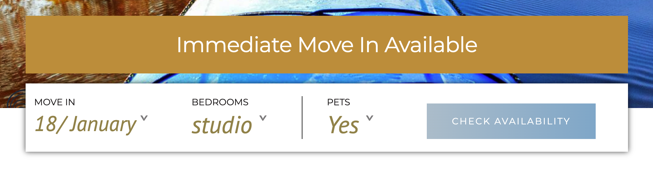
Check Availability Feature
With the check availability section, (located under the hero) I’m not convinced this is the best process – after clicking it prompts me to enter info which I feel is confusing.
I’d expect to see pricing and available units upon clicking. Another thing to note here is right above it says ‘Immediate Move In Available’…
It then asks to ‘check availability’ on a specific date so again, it’s a little unclear as to what the check availability is for exactly. I’d recommend either removing this or changing the wording to ‘Enter your details to speak to a team member’ – this would add a human touch.
Messaging
If you look at the messaging throughout the site, it follows the same focus on nature lovers and adventures – people who want to escape from the city life and be in touch with nature – shown clearly in the following statement:-
‘From outdoor adventure to the city’s center, surround yourself with the very best of Nashville’
This theme is continued throughout the site. Let’s take a closer look at specific messaging and sections:-
The hero section is good for the most part, covering some key points, however missing keywords, and the text over each slide is flattened, which means Google can’t read it. This is bad because the hero section is where you have a chance to tell Google your most important content.
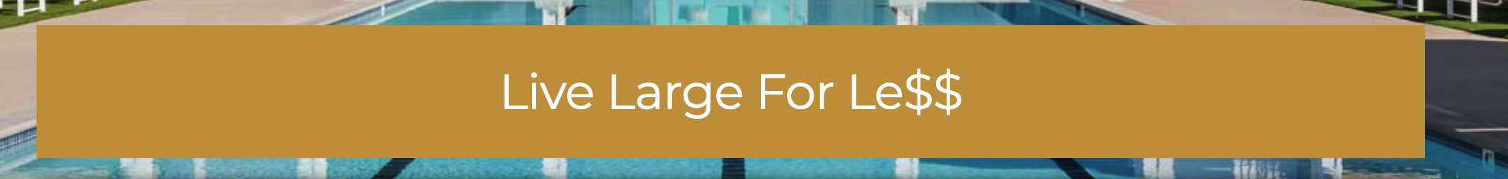
Live Large for Less – Good – it addresses Pricing and show’s the building

Adventure Awaits right outside – Good – it addresses Lifestyle (Adventure, Outdoors)

Peace of Mind – Good this addresses Feeling, Creates the sense of space, peace and tranquility

Immediate Move In Available – Good – addresses Availability, Ease of rental, instant move in. however the image doesn’t reflect the statement – ideally the image should reinforce the statement or vice-versa.
The following message seems out of place to me as it doesn’t add much value for me.

A River Runs Through It – The previous messages focus on a specific point and add value to the prospect. This last one could be improved by describing why the river is significant or important. An example would be to specify the “It” by changing the copy to ‘A River Runs Through Bells Bluff’ or ‘A River Runs Through Your Backyard’
Moving down through the home page I see they have a clear journey, again tackling various points.

01 Get More for Less
Here it show’s nice modern, spacious apartments and tackles pricing. I also notice here that there is an image of a woman with a dog – a nice touch reinforcing the fact that the building is pet friendly – this is also seen in various other parts of the home page including amenities and check availability.
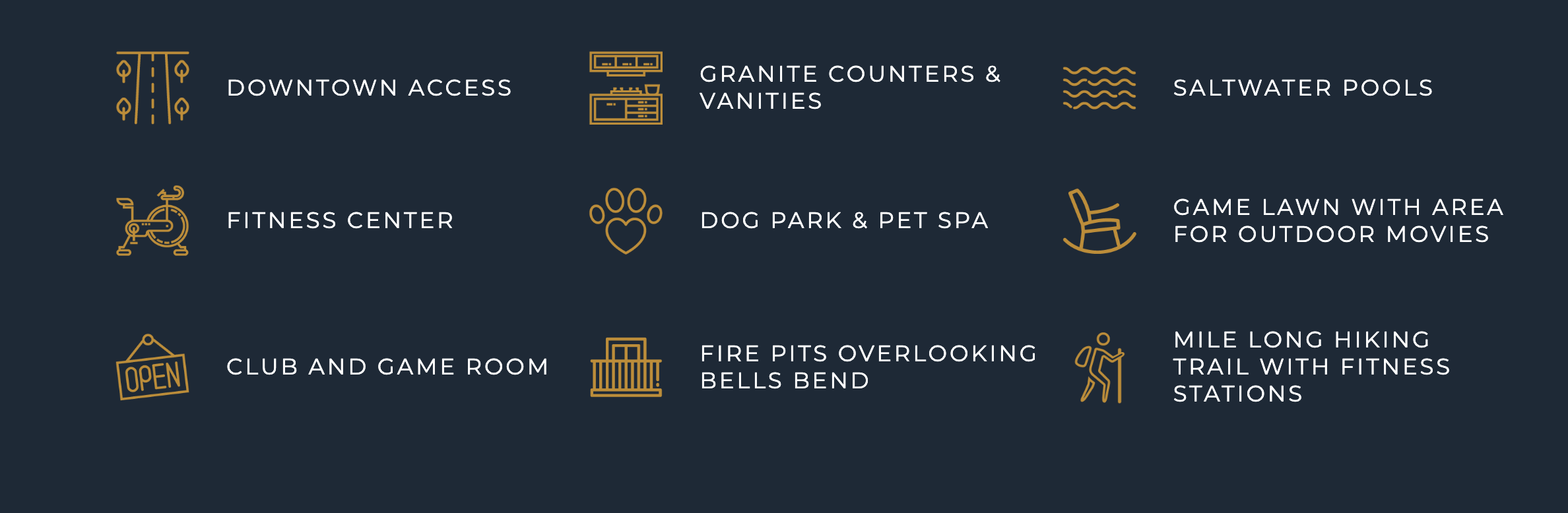
02 Amenities
This is definitely a necessity, however could be expanded on by linking to the amenities page, by doing this it encourages navigation and helps the user find the information they are looking for.
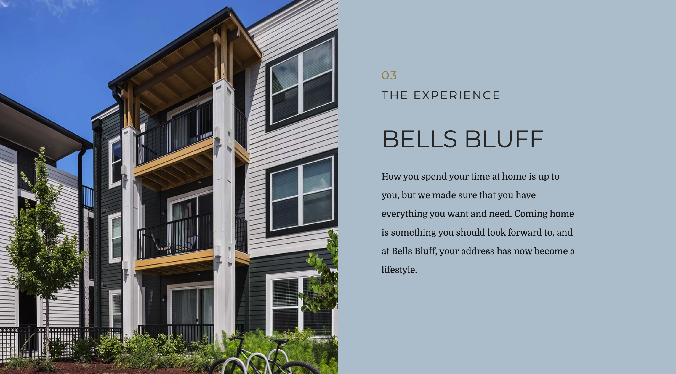
03 The Experience
This section I feel is a little confusing as I would expect to see more about the experience of living there and the surroundings. Here they could have included photos of people enjoying the previously listed amenities, to reinforce them and actually show them in use, adding value and a human touch.
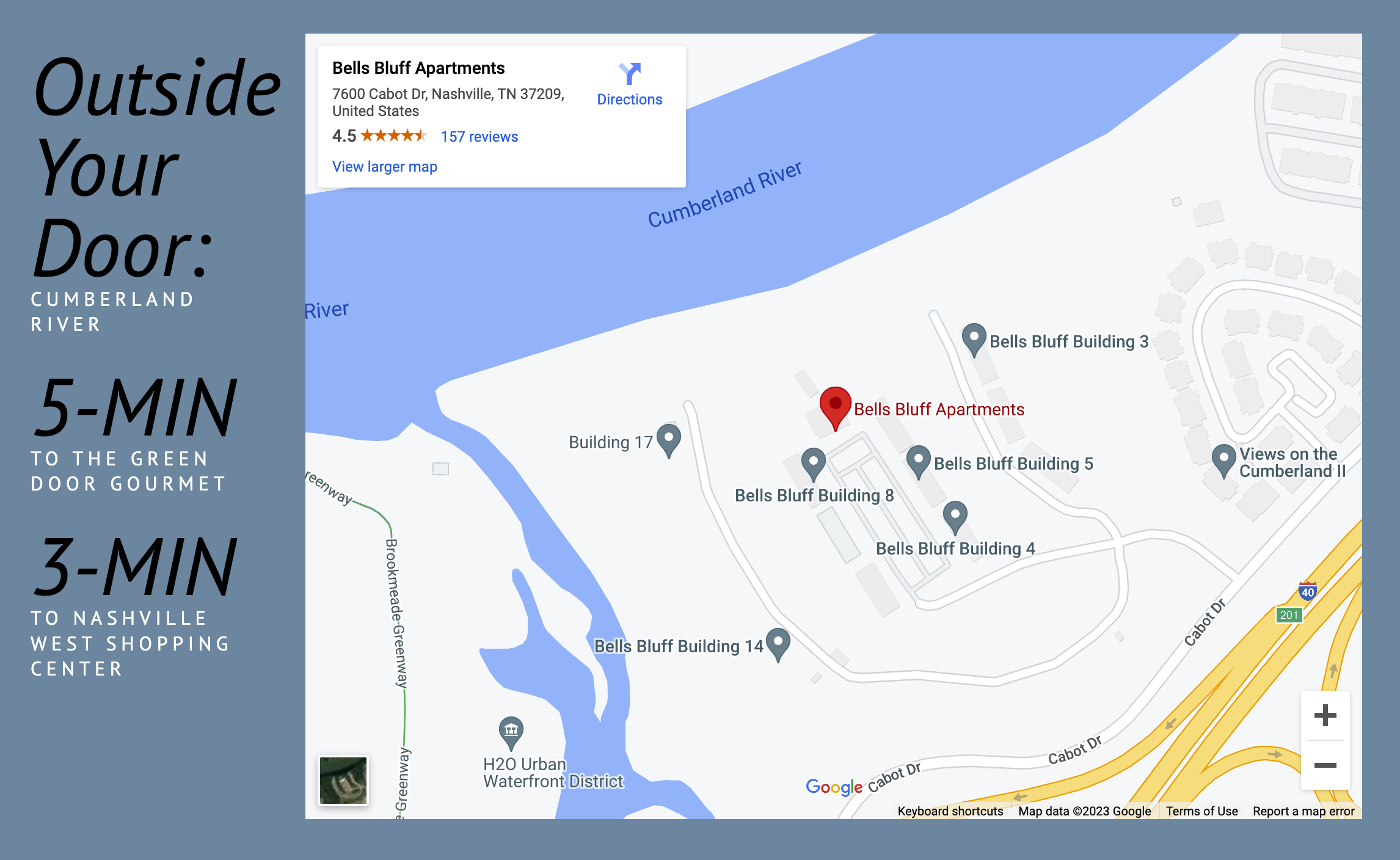
04 Location
Again a necessity but with a nice addition on the left, with the ‘X mins to X’ addition, which I would consider expanding on a little further to include the downtown area or daily commuting routes – this helps people understand what it would look like on their daily routines.
So I’ve reached the footer and one thing I note is I haven’t passed any CTA’s while moving down the page, which is important as they prompt the prospect to take action on a specific piece of information and move them into your funnel.
This could be to keep the prospect moving down towards the contact form at the bottom, although I’m not sure this is the best strategy – encouraging navigation and providing useful information is key.
However, I would strongly consider adding navigation and expanding on some of the topics when appropriate. For example, the amenities section could link to the Amenities Page, which gives more information. This is important as it encourages the prospect to explore more content, which in turn helps keep the ‘Time on Page’ up (helping SEO).
Navigation and Internal Pages
First off, the menu is well positioned and sticky, which means it stays at the top as you scroll down, allowing for easy navigation.
So let’s take a look at specific pages.
Experience: Overall good, however I notice repetition of messaging from the home page. There is opportunity here to expand on the living experience, potentially adding case studies or social proof from real residents.
Community: This page lacks content. I would recommend generating content about the community, neighbors etc and how Bells Bluff encourages community building through resident events and other activities.
Floorplans: This is a little confusing as the amenities are listed before the floorplans which could lead the prospect into thinking they are on the wrong page and therefore bouncing off.
Amenities: The zigzag style design works well but I think this could be improved by focusing on the lifestyle or experience, not just the amenity.
Residents Corner: Again this page lacks content and is a real opportunity to add helpful information. I also notice here there are various FAQ’s which have no answers. I’d recommend expanding on content and completing the FAQ’s section to avoid bounces/exits.
Contact: The contact information and form is pretty clear, however I’d consider adding social media channels.
Resident Portal: This for me is an off-brand experience, when I click through the website doesn’t reflect the previous site. It doesn’t open in new tab either which means if I click on it by accident or out of interest, I then have to click the back button to go back. This could lead to a bounce.
Areas for Improvement & Opportunities
Create a funnel
Guide the prospect starting with either a popular topic, pain point or useful piece of information which then prompts them to move to a specific page to enter their details. This helps increase conversions.
Core Topic > More Info > Contact
Expand on Content
There are various pages that I’ve mentioned which could be expanded upon to engage the prospect and convert. Content also helps significantly with SEO as it helps Google and your prospects understand what you are offering.
Better Use of H Tags
Most of the H-Tags or Header Titles on the home page do not include any keywords like for example, Bells Bluff Apartments, Bells Bluff Amenities, Apartment Rental Nashville… these are a crucial part of SEO, especially on the home page as Google uses these to understand content.
Add Internal Linking
Linking content within your website encourages visitors to navigate and helps them find the information they are looking for. It also helps Google understand what your content is about and the hierarchy of content.
Add Social Proof
Bells Bluff has 158 reviews with a 4.5 average rating and this is not shown on their website. Given the fact the community is focused on outdoor experience and lifestyle, I’d use some of the quotes from residents which reflect that as a selling point.
Add Social Media
Although Bells Bluff has social media profiles, they haven’t included this anywhere on their website, I would consider adding these as it helps with SEO and also with user engagement. Prospects use social media to see what others are saying about the community and view images.
Add a Blog
As far as I am aware, Bells Bluff don’t have a blog. This is a great opportunity to develop content to engage both prospective and current residents for example, an article on the top 5 hikes in the area, top river activities etc would resonate well with their audience. Not only that but if done correctly, would help with organic Google rankings.
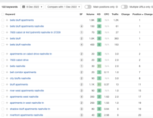
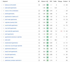
Google – Brand Search Bells Bluff
When it comes to brand search on Bells Bluff, they are doing ok, but with lots of room for improvement. They rank well for brand keywords which have a combined volume of around 4000 per month (Left chart Volume Column), however generic and variations keywords they are behind. Note the position column on the right hand table. This is partly due to their onsite content strategy.
 |
 |
Conclusion
The messaging throughout the website is good, however I feel there is some brand disconnect or inconsistency that could be improved upon. The use of color and imagery is good and I think they reach their audience or demographic well, however there is a great opportunity to engage both prospects and residents through content generation and increase brand awareness.